MONO are a band from Tokyo (Japan) and they play heavy, guitar-based, post-rock music. They're known for their lush, cinematic, instrumental soundscapes - a trait that's earned them descriptors such as 'contemporary classical' & 'cinematic'. I was recently presented the opportunity of drawing the official poster for their exclusive India appearance at Ziro Festival in Arunachal Pradesh. It was an absolute honour and a dream come true.
Official poster for MONO - 27 Sep 2018 - Ziro Festival, India.
The art for the poster was hugely inspired by the the band's music and its dynamism. It was my attempt to capture that 'drama' to paper. The setting, I would like to think, is that of a celestial (post) rock emerging from a transcendental portal; an opening that's birthed at the conjugation of two powerful forces - day and night. A limited run of 50 copies were printed; 20 of these were sold at the festival yesterday. The rest are now available on my store.
The poster is a two-colour serigraph expertly hand-pulled/printed by Pritam Arts on 130gsm Plike Black paper, yes, you read that right. All posters come signed and hand-numbered by the artist. You'll find all the details below.
'A Place To Bury Strangers' poster - Plike Black
Plike Black - $20 USD
16" x 23.5"
Plike Black 130gsm paper.
Two-colour serigraph (oil based).
Printed by Pritam Arts, IN.
Limited edition of 50, signed and numbered by the artist.
Thank you so much Anurag for carrying these to the festival. I owe you a big one! Thank you everyone else for your continued love and support. It means a lot!
Note: All items shall be shipped within 15 days of receiving the order. Please visit the store to read the FAQs, see close-up shots of the print and other relevant details.
A Place to Bury Strangers are a New York City-based American band that play heavy noise music, a characteristic blend of psychedelic rock, shoe-gaze and space rock. I recently had the opportunity of drawing a poster for one of their shows during their tour 'Live and Insane' tour. The poster was for their performance at Sidecar in Barcelona, Spain on the 2nd of September, 2018.
Official poster for A Place To Bury Strangers - 02 Sep 2018 - Sidecar, Barcelona.
The idea for the poster came from the band's name and an exploration of what that 'place' might look like. It's turned out pretty alright. The poster is now available as a screen-print on my store. These posters are single colour serigraphs expertly hand-pulled/printed by Pritam Arts on 135gsm Classic Ivory paper. All posters come signed and hand-numbered by the artist that is I. Other than the Classic Ivory edition, I'm adding 4 unique test prints from my proof set. There's only a single copy of each of these and hence, they will be priced slightly higher than the regular edition. You'll find all the details below.
'A Place To Bury Strangers' poster - Classic Ivory
Classic Ivory (regular) - $25 USD
15" x 23"
Classic Ivory 135gsm paper.
One-colour serigraph (oil based).
Printed by Pritam Arts, IN. Limited edition of 20, signed and numbered by the artist.
'A Place To Bury Strangers' poster - Matter Andina Grey
Matter Andina Grey (test print, variant)- $30USD 15" x 23" Matter Andina Grey 135gsm paper. One-colour serigraph (oil based). Printed by Pritam Arts, IN. Single copy, signed by the artist.
Thank you everyone for your continued love and support. It means a lot!
Note: All items shall be shipped within 15 days of receiving the order. Please visit the store to read the FAQs, see close-up shots of the print and other relevant details pertaining.
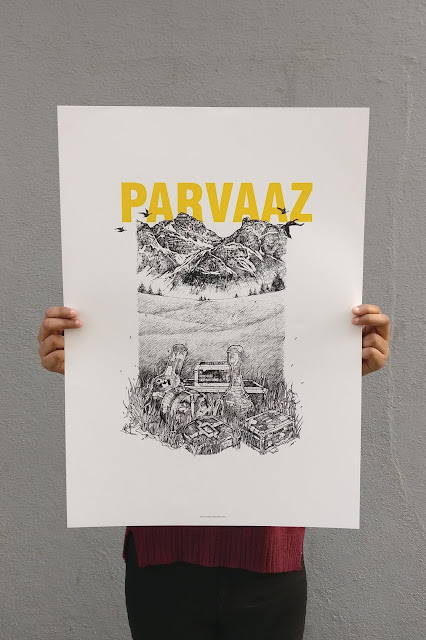
Parvaaz is a rock band from Bangalore, India. One of the biggest bands of the country, they're known for their brand of psychedelia-infused, arena-ready blues rock they can call their own. In July last year, the band approached me to draw the tour poster art for 'A Rooted Departure' - the band's first ever tour of Canada.
I first listened to Parvaaz in 2012, the year the band released their debut EP 'Behosh'. I couldn't make it to any of the launch shows but I managed to snag a physical copy of the EP. Ever since, I've been a huge fan. It was an absolute honour to have been asked to draw for them. This blog post is an attempt to give you an inside on how I went about the whole thing.
Parvaaz - 'A Rooted Departure'
Concept
The band had a clear visual in mind - "some abandoned instruments in the open, say in a meadow under the sky may be with some hills at the back". This was the basic premise that we then built on. As the band and I discussed further, we noticed a certain dichotomy at play which we then chose to expand on. While the hills were a clear reference to the Canadian Rockies, the place the band was going to, they were also a hat tip to Kashmir, the place (half) the band is from. Yes, the instruments in the middle of nowhere represented the band's departure or this sense of estrangement but it could also be seen as the band's arrival. This idea seemed to perfectly embody the band's feelings about the tour, the nervousness, the excitement - everything.
The challenge? I had less than a week's time to finish it. It seemed impossible! Those who have followed my work will know the frequency (or should I say, the intermittency?) at which I put out new work. It is what my schedule permits. So I wasn't exactly prepared when I agreed to the commission but I did. I mean, it isn't every day that the biggest band of the country commissions you to draw the tour poster for their first ever international outing.
Anyway, back to the concept. The idea was frozen, all I had to do was figure out a way to draw and compose the said idea in a way that it brought enough drama, captured the overall essence and make sure it fit the tour poster aesthetic.
This is what I came up with. Instruments right in the front, grassland in between and big hills at the back. The hills occupied most of the space. They are easier to ink, involve a lot of negative space which meant lesser time spent inking. The grasslands were made up of several molehills instead of flat plateaus, to help achieve the visual depth within a small amount of space. I also decided to use some Canadian geese in flight to convey the vastness of the composition. We'd considered including a water body and at some point we even considered doing a big sun-like shape at the back but they were all scrapped for the sake of a bolder visual. All these decisions were taken to minimize the inking time as much as possible and ensure a clean, focused visual. The entire procedure took less than a day. I'm particularly proud of this because usually this stage is what takes the longest amount of time.
Drawing
As soon as the concept sketch was approved, I got onto acquiring references. This is an important step during any commission. I try and accumulate as much as I can, especially when the art I'm about to draw involves elements I'm not familiar with. For this one, it was mostly the instruments and the travel cases. The band helped immensely with the reference images. You've gotta love it when a band is so invested. We wanted to make sure the ensemble that ends up on the artwork was an accurate depiction or at least was as close as it could get. We had to lose a few boxes for the sake of the composition but that's alright. Here's a screen-grab of the pool of reference images I used to draw the artwork.
From there, I moved onto the drawing board and started work on the final art. Following are some photographs I managed to take at various stages of drawing the artwork. As you can see, I do not use a lot of pencil work. I just make sure I have the proportions right and make the bigger shapes, I do the detailing straight with ink. It's just something I'm comfortable with and in this case in particular, it's helping me save a lot of time. Please ignore the quality of the images.
The earlier plan was to confine the complete artwork within a rectangle. It's at this stage that I realized that I could project the instruments a bit outwards and further emphasize the visual depth in the artwork. I love making these subtle compositional overrides; they make any drawing stand out in my opinion.
This is what my desk looks like while I'm working on a drawing. If I remember correctly, we finalized the concepts on a Sunday. That meant, I only had weekdays (or whatever that was left of it after work) to finish the drawing. This meant consecutive all-nighters. That should explain the low light on the images above. It is why I decided to make this time-lapse video as against the usual close-up shots.
Next, I had to draw the text that was to appear on the poster. I chose to do this instead of using a typeface to keep up the whole hand-crafted vibe. If given a choice, I would make everything that goes on a poster from scratch - that way you own everything that's on it. But that's not how it turns out most times. Anyway, here's what the text looked like. The band felt it needed something worn-out and "cargo" to go with the whole tour/travel thing. I couldn't disagree.
Post-processing
Once the art was finished, I scanned everything at 600 DPI resolution and took it onto Adobe Photoshop for post-processing. I use a HP DeskJet 1050 All-in-One Color Inkjet Printer to scan all my work. It won't let me scan anything larger than an A4; it is why I stick to that size for most my drawings. It's just easier this way. I have, on occasion, drawn on an A3 but then the struggle to scan the drawing in parts just doesn't make it seem worth it.
As of the post-processing, I primarily use Photoshop to adjust the levels and enhance the blacks in a drawing. That and to separate the colours, if any. This is the stage I separate the blacks and have them on a completely different layer and add masks. This gives me greater control and the ability to may be even colour the drawing in the future if the need arises.
I do not know how many of you must have noticed but there's a few differences in the original drawing and the final poster art that came about. I had to make a number of tiny tweaks to incorporate some of the feedback I received from the band. I used some tracing sheets to make these additions. I'm adding some of the scans below. These mostly involved the stickers on the instruments; they needed to look more "traveled" and yes, we added a whole new box to go on the top of the bigger one at the back - this was so we could have the tour name on it without making it look out of place.
Here is what the final drawing looked like after all the changes. This is what was sent to the band.
I couldn't take up the poster design work as I had other things to attend to at the time. So the poster you see on the band's website and all its socials, the one with the tour dates and the sponsors, was put together by Sachin, the band's drummer. The artwork was also used on the band's tour-only t-shirt, media-kits, standees and some other creatives.
Once the band returned from Canada, the band got busy playing shows across the country and it almost felt as if the artwork had lived its course. It was done. During this time all I could think about was if there was any way to put the art out. I did not want to put it out as a t-shirt or a digital print; it had to be more than that. It had to be an experience in itself. It had to be special! I chose to wait.
Around the same time, I was working on the art for Cinema of Excess' debut EP. Other than the art, I was also taking care of the packaging for the release. We'd unanimously decided to scrap jewel-cases and had started to look for workable alternatives. I was a big admirer of the work they did at ACDSleeve. These guys were creating unique, hand-crafted packaging for music releases. I wanted to do something like it. Something that was special but at the same time easy on the band's pockets. That's when I was introduced to Pritam Arts by my good friend Sajid, who was also working on something similar for my friends in DEATHBYFUNGI and Shepherd.
I immediately spoke to Prajwal, we exchanged e-mails, brainstormed ideas, put together a plan and by the end of the year we'd designed and produced some beautiful front-to-back, screen-printed CD sleeves that we were immensely proud of. That was the moment I knew exactly what it was going to be.
Screenprint
The art was never created keeping in mind that it would be screen-printed at some point. The drawing had a lot of detail and almost all of it was on the sketchier side. This made things a little nerve-wracking. I had carried the print files with me to Mumbai the time I visited Prajwal and Mendon uncle at their studio to work on the Cinema of Excess CD sleeves. This poster wouldn't have looked the way it does had it not been for them. I owe a great deal to these fine people. Right from tinkering with the source file to exposing the screens and printing, these guys did a phenomenal job.
We decided to do a limited run of 100 prints, it was a number both the band and I were comfortable with. Something of this scale hadn't been done before so it had to be a calculated risk. The posters were going to be 17" x 24" in size - that's a little smaller than a standard A2. We were going to use two-colours, matte black for the art and glossy yellow for the band name. The prints were going to be pulled on 160gsm Iris SG white paper. Here is what they looked like.
I couldn't be around during the printing process so I do not have a lot of photographs. Prajval was kind enough to share some pictures, I've added those below.
.
He also managed to take a good number of videos capturing the key stages of the screen-printing process. Good friend Abheet (Cinema of Excess, blankfound) stitched these together and made this really cool video. This should give you a good idea of what went behind creating a single screen-print. Have a look!
The posters were sold at the band's Bengaluru show on the 16th of February, 2018 at Fandom At Gilly's Redefined in Koramangala. The leftovers were then made available to the general public the following week. We completely sold out of all the prints in the last week of August this year. It was a proud moment!
This whole thing has been such a labour of love; right from drawing the artwork to finally seeing it in print and then sell out. This is one of the things I set out to do and I'm glad to have had the opportunity to. This country needs a gig poster culture and I'll try and do my bit to bring it about. We've successfully championed a feat that seemed impossible a few years ago. Here's to more screen-prints!
To celebrate this momentous occasion I'm currently giving away some test-prints on my Instagram. It involves some beautiful, one-of-a-kind prints that I feel are collector-worthy. Follow the post below or visit my Instagram profile to participate. I'm on @anoopkbhat!EDIT: The giveaway is now closed.
I wouldn't want to end this post without thanking a few important people.Thank you Khalid, Kashif, Sachin and Fidel for, first of all, believing in my work and then presenting me with this opportunity. Thank you for being such sports and coming on-board to do something that was completely new. Thank you Yama for being so efficient and facilitating the entire thing so smoothly - it was a breeze. Thank you Pritam Arts - none of this would have been possible without your expertise. Thank you Prakriti and Kunaal for carrying the posters all the way from Bombay to Bangalore. Thank you Abheet for that wonderful video work. Thank you Anna for all the help and the constant support. You're the best!
Lastly, thank you to each and every one of you who bought a print or shared the art or liked a post - it all matters. Thanks a lot! It means a great deal to the band and I.
To more screen-prints!
P.S. There is more..
Parvaaz with screen-print no. 1/100 at Fandom, Koramangala, Bangalore


